Ask Professor Puzzler
Do you have a question you would like to ask Professor Puzzler? Click here to ask your question!
Merry Christmas! A couple years ago I mentioned here that someday I would post instructions and templates for creating various ornaments out of cardstock and/or photo paper. Considering we're just days away from Christmas, some parents may be looking for fun activities to do with their children to pass the time on their way to the most anticipated day of the year, so I have put those plans online at last!
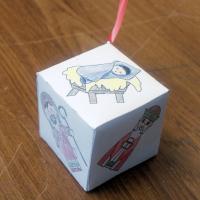
We have a whole "Paper Craft" section now, and it includes instructions for several ornaments like the one shown here. Note that the templates are blank (without images). This allows you to add your own clipart (in case you wanted a Santa-themed ornament, or a snow-themed ornament instead of a religious-themed ornament).
And you don't need clipart at all; I printed out some blank ones and my kids loved drawing their own pictures on them.
We have the following ornament templates/instructions:
The cube is a good size to put on a tree; the other two are too large for a tree. The dodecahedron was designed as a table-top ornament, and the icosahedron as an ornament to hang from the ceiling or doorway frame.
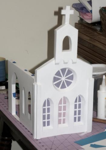
In addition to the ornaments, there are several tutorials, in case you are interested in designing your own projects, such as the partially complete cathedral shown here.
Happy crafting, and Merry Christmas!
"Hello The Professor. Please explain additive and subtractive in art." ~Anon
I'm assuming you mean additive and subtractive colors. This is a fascinating topic from both an artistic and a scientific point of view.
Additive Color Sample
One of the best ways for me to help you visualize additive colors is to show you some color swatches generated on my computer. These color swatches will progress from left to right with the left-most swatch being fully saturated red, and then progressively adding more and more blue and green, until the blue and green are fully saturated in the last swatch. You can see that the swatches progress from red to pure white.

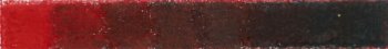
Subtractive Color Sample
For the subtractive color sample, I used my ![]() Prismacolor Premier Pencils. I made eight swatches in the following manner. I covered the entire region with my
Prismacolor Premier Pencils. I made eight swatches in the following manner. I covered the entire region with my ![]() Crimson Red* pencil. Then I covered seven of the eight swatches with
Crimson Red* pencil. Then I covered seven of the eight swatches with ![]() Copenhagen Blue and
Copenhagen Blue and ![]() Grass Green. I then covered the entire region with red again, and colored six regions with blue and green. I repeated this process until my last layer of blue and green was just on the final square. The final result is that each swatch has eight layers of red, and successively from left to right they have 0, 1, 2, 3, 4, 5, 6, and 7 layers of blue and green. I've simulated the conditions of the additive sample, except using pigments instead of light.
Grass Green. I then covered the entire region with red again, and colored six regions with blue and green. I repeated this process until my last layer of blue and green was just on the final square. The final result is that each swatch has eight layers of red, and successively from left to right they have 0, 1, 2, 3, 4, 5, 6, and 7 layers of blue and green. I've simulated the conditions of the additive sample, except using pigments instead of light.
As you can see (and I verified using a color-chooser tool in my graphics software) the last square is almost perfectly gray with just a hint of blue (it's very close to black - we would call it 85% cool gray).
What's the Difference?
One simple way of describing the difference is to say that in one case, light is emitted, and in the other, it is reflected. It should seem reasonable to you that if you add more light, you'll get something brighter, not something darker.
My computer screen is emitting the light, rather than reflecting it.
But when you're dealing with pigment, you're not dealing with something that emits light; you're dealing with something that reflects light. My red pencil reflects red light. But wait! If it reflects red light, what does it do to all the other colors of light? It absorbs them. So white light (which is made up of all the colors) hits my red pencil, all the visible light except the red gets absorbed and doesn't reflect (in reality, the pencil is made up of pigment suspended in wax, so it is somewhat translucent; some of the light passes through the wax and pigment, hits the white paper, and is reflected back).
Of course, the same is true of the blue and green; the blue pencil absorbs everything except blue light, which it reflects, and the green pencil absorbs everything except green. So what happens when I put a layer of red, a layer of blue, and a layer of green down on paper? Each of the three colors is partly absorbed by the other two pigments, which deadens the color. Keep adding more layers, and you decrease the translucence, and the color gets more and more "dead and dark." Why is it called "subtractive"? Because more and more light is absorbed, which decreases the amount of light that is reflected.
* I've included Amazon links to the individual colors so you can see what they look like, but I don't really recommend buying individual pencils from Amazon. You'll get a good deal on a set from Amazon, but when it comes to buying individual pencils (which you will do on a regular basis - you'll find there are certain colors you just love using, and you can't get enough of them), you'll want to visit your local art store (and I don't necessarily mean the big name chains like Hobby Lobby) and see what their prices are. If you are fortunate to have a locally owned art store, consider supporting them with your business. If you spend some time getting to know the people that run them, you may feel comfortable asking them questions about their business. You may find that they take a loss on some items in order to get people in the store. Find out where they make their money (it's probably scanning and framing of artwork), and take that business to them.

