Ask Professor Puzzler
Do you have a question you would like to ask Professor Puzzler? Click here to ask your question!
Jon from California hopes that I can explain why total population of a country doesn't "matter" to infection spread.
Jon's question stems from a very common issue - many people will argue that if we are going to compare one country's coronavirus infection with another country's, rather than comparing total cases, we should be comparing the infection percent. It's easy to see why people from the United States want to make that comparison; the United States has a massive population, so if we look at percentages, it makes it look like we're actually "doing better" than much smaller countries. In fact, I've seen people sharing graphs like this one below (click the image to view it at full size):
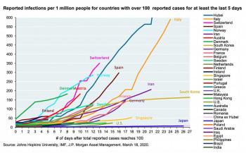
If the only thing you see is this graph, you're going to assume that the United States is doing better than just about every country out there. So let's look at the math and see why this graph - while it makes us feel good - doesn't actually provide the full picture.
The Thief Analogy
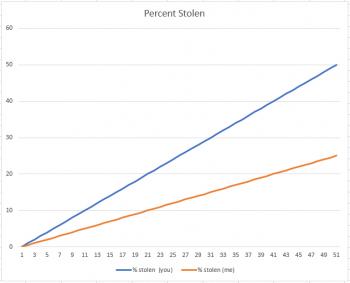
Suppose you have $100 and I have $200. A thief comes along and says, "For the next fifty days, I'm going to steal $1.00 from each of you each day." I might say, "I'm better off than you, because he's stealling 50% of your money, and only 25% of mine." And I'd be right, as the graph below shows:
But now suppose the thief came to us and said, "I'm going to steal $1.00 from each of you indefinitely." Now, all of a sudden, I'm not interested in comparing my percent with yours. Why? There are two reasons. First, I have more money to be stolen, and second, the only difference between you and me is that it's just going to take longer for him to take all my money. But in the end, the graph will look like this:
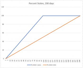
Your percent stolen increases until it reaches 100%, and then it sits there at 100% until my percent matches yours. You've lost $100, because that's all you had, and suddenly the fact that I used to have $200 only means that I lost 100 dollars more than you did.
What's the difference between the two scenarios above? One is a closed situation, and the other is open-ended. As long as we put an end date on the thievery, I feel good about having a bigger "money population" than you do. But if it becomes open-ended, that doesn't actually matter anymore.
The Apple Analogy
Suppose you have two baskets. One has 100 apples, and the other has 1000 apples. Each basket has one rotten apple. And every day, any rotten apple turns one other apple rotten. If we think of this as a percent population problem, and just look at the first six days, it definitely looks like basket #2 is doing better:
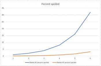
But if we extend the graph from six days to eleven days, we get a much different picture:
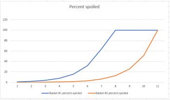
This example works out just like the thief example; the short-term graph is deceptive, but the long-range graph let's you see how the situation ends. The primary difference is that, like a virus, the apple example is exponential in nature, so the graphs share a similar shape to the ones related to coronavirus.
But...
Infection Rates Don't Work Quite Like This
Viral infections don't work exactly like this. For starters, an apple will never recover from rot, and therefore it will never become immune to rot, and never stop passing on the rot. Thus, it is guaranteed that eventually rot will reach all 1000 apples.
But with an infection, people do recover, and when they do recover, they become immune, and cease to be carriers.
Why does this matter? Suppose that you have a sickness, and on any given day you have a 10% chance of infecting each person you interact with. Let's also suppose that on average, you interact with 100 people. This means that you'll likely infect 10 people on the first day. The next day, you interact with another 100 people, and infect 10 more. The next day, you interact with 100 people, but because you (and others like you) have been spreading infection, some of those people (let's say 10 of them) are already infected. Since there are only 90 people you can infect, you'll end up infecting 9 people instead of ten.
If half the population becomes infected, 50 out of your 100 people have already been infected, so you'll only infect 5 more.
Eventually the massive spread of the sickness will meet head on with a dearth of new people to infect, and the infection rate will stop increasing. In math we refer to that as an inflection point. It's the point where the rate of increase begins to decrease (if you can wrap your brain around that idea!). In case you care about the deeper mathematics of the situation, an inflection point is where the second derivative goes to zero and then changes sign.
The mathematical term for this kind of growth pattern (you'll see example graphs below) is a logistic curve.
And here's where things get complicated, because the inflection point doesn't just depend on the virus - it depends on MANY factors, including us, and our behavior. If I, as an infected person, stop interacting with 100 people every day, and instead interact with only 5 people, I've changed how the sickness spreads.
But all other things being equal, the inflection point is primarily based on population. If there are only 1000 people for me to interact with, everyone is going to very quickly start interacting with the same people over and over. But if there are millions of people, the infection can spread to many many more people before we reach the point that I'm mostly interacting with people who have already been infected.
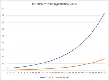
I invented a hypothetical virus (emphasize hypothetical - this is NOT coronavirus) which reaches its inflection point at around 20% population before the infection rate starts to decrease. I also created a graph showing % infected for two countries: one with a population of about 60 million, and the other with a population of about 300 million. My first graph shows how things stand after 35 days. You can see clearly that, as a percentage, country #2 (the one with a massive population) is doing far better than country #1, which already has almost 1% of its population infected.
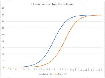
But now fast-forward to Day 150. You can see from the graph below that at approximately Day 73 country #1 hit its inflection point, and country #2 hit its inflection point about 20 days later. By the time we reach Day 150, both countries have settled down to about 40% of their populations infected.
So now that we've seen where this situation takes us, let's take that last graph and remove the percentage calculation from it, so we can see how it affects total population. The graph below shows infections in 10,000s of people.
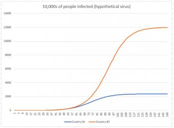
While country #1 appeared to be doing much worse in the first graph (because we were looking at a short-term graph), once we extend the graph to its conclusion, we see that in reality, country #2 had far more infections. Country #1 had 24 million infections, while country #2 had 120 million. Why did country #2 have so many more infections? Because the infection had more people to work its way through. Just like the thief had more dollars to work through, and the rot had more apples to work through.
People may tell you that comparing the number of infections in one country to the number of infections in another country without regard to population is like comparing apples to oranges. Instead, as you can see here, comparing percentages is the comparison that is apples-to-oranges. It may make you feel good in the short term, but feeling good about the short term without considering the long term is actually a short-sighted way to view the world.
As an addendum to this, it's worthwhile to note that there is a time when the percent graph is very informative: when the disease has run its course. At that point, we will look at the total population numbers and certainly grieve over each loss of life, but we will also look at the percentage graph. Not all countries will have halted the disease at the same population percentage, and when all the numbers are in, those percentages will be meaningful. The data will help us understand how we did in comparison to other countries. Not to gloat or grieve, but rather, to help us understand what measures were effective and which were not, so we will be better prepared next time.


