Ask Professor Puzzler
Do you have a question you would like to ask Professor Puzzler? Click here to ask your question!
Michelle from Maine wants an explanation of the difference between linear-scale graphs and logarithmic-scale graphs. Her question relates to coronavirus infections and COVID-19 deaths, so I'm going to use COVID-19 data in my answer.
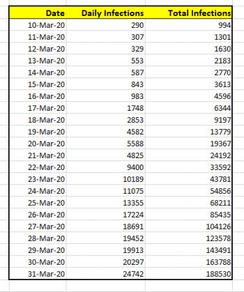
For this explanation, I'll going to use the data for US coronavirus infections, from March 10, 2020 to March 31, 2020. That data is shown below. The data was obtained from Worldometer stats from April 1, 2020.
If I wanted to simply chart the total number of cases against the date, the graph would look like this:
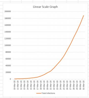
Now, this graph looks a bit scary, because it's clear from this graph that the number of cases is skyrocketing very quickly. And this is the nature of an exponential curve. If we could continue this graph a month into the future, and the growth remained as it currently is, it would still have roughly the same appearance, except that instead of the March 31st data being at the top of the graph, it would be down near the bottom because the new numbers would completely dwarf it.
It's important to know that in recent days this is not the graph which has been making the rounds on social media and in news articles. Mathematicians (and scientists) have a different type of graph we like to use when we're dealing with exponential curves: it's called a logarithmic scale graph. In a logarithmic graph, we keep the x-axis (the date values) the same, but we do some "squishing" of the y-axis. How do we perform this squishing?
Logarithmic Squishing
Normally if you were drawing a graph on a piece of graph paper, you would say, "Each square is worth 1 unit," or "Each square is worth 100 units." But regardless of what you decided, you would consistently consider each square to be worth the same amount. You can see that this is what we've done in the linear-scale graph above. Each horizontal line marks off the same amount: if you go up one line, you've gone up 20,000 infections. That's true at the bottom of the graph, and it's also true at the top of the graph. (200,000 - 180,000 = 20,000).
But if you're drawing a logarithmic graph, each square height has a different value depending on how far up the graph it is. If the first square is worth 1 unit, the square above it is worth 10 units, the square above that is worth 100 units, and the square above that is worth 1000 units. You can see what's happening, right? Every square is worth TEN TIMES as much as the square below it. The result is that the entire graph gets squished. For mathematicians and scientists it's a great way to get a lot of data into a single graph. This is what our data looks like when it's graphed this way:
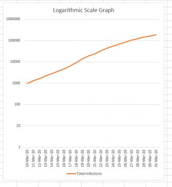
Notice how the difference between the first two horizontal lines is 10 - 1 = 9 infections. The difference between the next two horizontal lines is 100 - 10 = 90. Continuing on to the top, we see that the difference between the last two lines is 1,000,000 - 100,000 = 900,000.
It's really, REALLY important to understand that the two graphs above are actually BOTH SHOWING THE SAME DATA, just in very different ways.
Logarithmic scale graphs can be very useful; if a graph is exponential, its logarithmic counterpart will be a straight line. The slope of that straight line (how steep it is) helps us understand how quickly the graph is rising. It basically becomes a rate-of-change graph, which is why most news sites that are showing multiple states/countries in the same graph are using a logarithmic scale. Comparing the logarithmic graphs lets us see more easily which states/countries are doing better/worse at containing the infection. If the logarithmic graph for New Jersey is steeper than the logarithmic graph for New York (which it currently is) that helps us to understand that the infection is spreading more rapidly in New Jersey (even though the number of infections in New York currently VASTLY outnumbers the New Jersey infections).
The Danger
The danger, of course, is that most people don't really understand the difference between a linear-scale and a logarithmic-scale graph. So when we repeatedly see logarithmic graphs, it's easy to get fooled into thinking that the growth is linear, when it's actually exponential. If you are looking at a news site that shares graphs of infections (or deaths) look for an option to go in and out of logarithmic mode. Look at the data in BOTH modes, now that you understand why the modes exist. The linear-scale graph gives you reality, while the logarithmic-scale gives you a mathematical tool for comparing rates of growth.

