Ask Professor Puzzler
Do you have a question you would like to ask Professor Puzzler? Click here to ask your question!
Jon from California hopes that I can explain why total population of a country doesn't "matter" to infection spread.
Jon's question stems from a very common issue - many people will argue that if we are going to compare one country's coronavirus infection with another country's, rather than comparing total cases, we should be comparing the infection percent. It's easy to see why people from the United States want to make that comparison; the United States has a massive population, so if we look at percentages, it makes it look like we're actually "doing better" than much smaller countries. In fact, I've seen people sharing graphs like this one below (click the image to view it at full size):
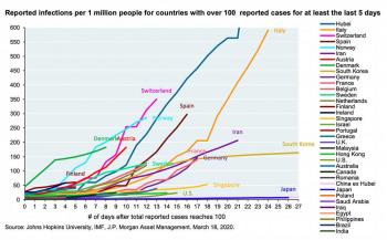
If the only thing you see is this graph, you're going to assume that the United States is doing better than just about every country out there. So let's look at the math and see why this graph - while it makes us feel good - doesn't actually provide the full picture.
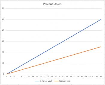
The Thief Analogy
Suppose you have $100 and I have $200. A thief comes along and says, "For the next fifty days, I'm going to steal $1.00 from each of you each day." I might say, "I'm better off than you, because he's stealling 50% of your money, and only 25% of mine." And I'd be right, as the graph below shows:
But now suppose the thief came to us and said, "I'm going to steal $1.00 from each of you indefinitely." Now, all of a sudden, I'm not interested in comparing my percent with yours. Why? There are two reasons. First, I have more money to be stolen, and second, the only difference between you and me is that it's just going to take longer for him to take all my money. But in the end, the graph will look like this:
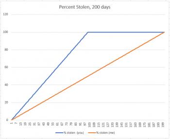
Your percent stolen increases until it reaches 100%, and then it sits there at 100% until my percent matches yours. You've lost $100, because that's all you had, and suddenly the fact that I used to have $200 only means that I lost 100 dollars more than you did.
What's the difference between the two scenarios above? One is a closed situation, and the other is open-ended. As long as we put an end date on the thievery, I feel good about having a bigger "money population" than you do. But if it becomes open-ended, that doesn't actually matter anymore.
The Apple Analogy
Suppose you have two baskets. One has 100 apples, and the other has 1000 apples. Each basket has one rotten apple. And every day, any rotten apple turns one other apple rotten. If we think of this as a percent population problem, and just look at the first six days, it definitely looks like basket #2 is doing better:
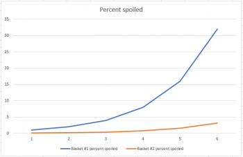
But if we extend the graph from six days to eleven days, we get a much different picture:
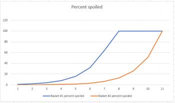
This example works out just like the thief example; the short-term graph is deceptive, but the long-range graph let's you see how the situation ends. The primary difference is that, like a virus, the apple example is exponential in nature, so the graphs share a similar shape to the ones related to coronavirus.
But...
Infection Rates Don't Work Quite Like This
Viral infections don't work exactly like this. For starters, an apple will never recover from rot, and therefore it will never become immune to rot, and never stop passing on the rot. Thus, it is guaranteed that eventually rot will reach all 1000 apples.
But with an infection, people do recover, and when they do recover, they become immune, and cease to be carriers.
Why does this matter? Suppose that you have a sickness, and on any given day you have a 10% chance of infecting each person you interact with. Let's also suppose that on average, you interact with 100 people. This means that you'll likely infect 10 people on the first day. The next day, you interact with another 100 people, and infect 10 more. The next day, you interact with 100 people, but because you (and others like you) have been spreading infection, some of those people (let's say 10 of them) are already infected. Since there are only 90 people you can infect, you'll end up infecting 9 people instead of ten.
If half the population becomes infected, 50 out of your 100 people have already been infected, so you'll only infect 5 more.
Eventually the massive spread of the sickness will meet head on with a dearth of new people to infect, and the infection rate will stop increasing. In math we refer to that as an inflection point. It's the point where the rate of increase begins to decrease (if you can wrap your brain around that idea!). In case you care about the deeper mathematics of the situation, an inflection point is where the second derivative goes to zero and then changes sign.
The mathematical term for this kind of growth pattern (you'll see example graphs below) is a logistic curve.
And here's where things get complicated, because the inflection point doesn't just depend on the virus - it depends on MANY factors, including us, and our behavior. If I, as an infected person, stop interacting with 100 people every day, and instead interact with only 5 people, I've changed how the sickness spreads.
But all other things being equal, the inflection point is primarily based on population. If there are only 1000 people for me to interact with, everyone is going to very quickly start interacting with the same people over and over. But if there are millions of people, the infection can spread to many many more people before we reach the point that I'm mostly interacting with people who have already been infected.
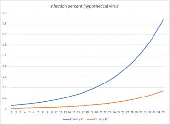
I invented a hypothetical virus (emphasize hypothetical - this is NOT coronavirus) which reaches its inflection point at around 20% population before the infection rate starts to decrease. I also created a graph showing % infected for two countries: one with a population of about 60 million, and the other with a population of about 300 million. My first graph shows how things stand after 35 days. You can see clearly that, as a percentage, country #2 (the one with a massive population) is doing far better than country #1, which already has almost 1% of its population infected.
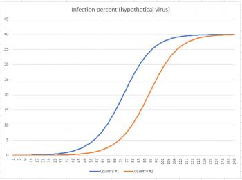
But now fast-forward to Day 150. You can see from the graph below that at approximately Day 73 country #1 hit its inflection point, and country #2 hit its inflection point about 20 days later. By the time we reach Day 150, both countries have settled down to about 40% of their populations infected.
So now that we've seen where this situation takes us, let's take that last graph and remove the percentage calculation from it, so we can see how it affects total population. The graph below shows infections in 10,000s of people.
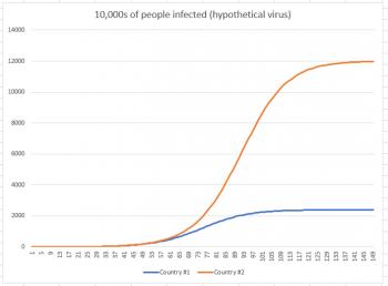
While country #1 appeared to be doing much worse in the first graph (because we were looking at a short-term graph), once we extend the graph to its conclusion, we see that in reality, country #2 had far more infections. Country #1 had 24 million infections, while country #2 had 120 million. Why did country #2 have so many more infections? Because the infection had more people to work its way through. Just like the thief had more dollars to work through, and the rot had more apples to work through.
People may tell you that comparing the number of infections in one country to the number of infections in another country without regard to population is like comparing apples to oranges. Instead, as you can see here, comparing percentages is the comparison that is apples-to-oranges. It may make you feel good in the short term, but feeling good about the short term without considering the long term is actually a short-sighted way to view the world.
As an addendum to this, it's worthwhile to note that there is a time when the percent graph is very informative: when the disease has run its course. At that point, we will look at the total population numbers and certainly grieve over each loss of life, but we will also look at the percentage graph. Not all countries will have halted the disease at the same population percentage, and when all the numbers are in, those percentages will be meaningful. The data will help us understand how we did in comparison to other countries. Not to gloat or grieve, but rather, to help us understand what measures were effective and which were not, so we will be better prepared next time.
[A note from Professor Puzzler: in addition to reading a lot of useful information about coronavirus here, don't forget for children who are stuck at home, we have plenty of online educational resources here on this site: games, reference units, lesson plans, printable worksheets, and more.]
In the last few days I've been asked several questions that are related to the coronavirus and how it is spreading around the world. I'd like to address several of the common questions I've seen. Please note that I am neither a biologist nor an epidemiologist (although I do know how to research and learn), but many of the questions I've fielded have their roots in mathematics, which is my primary field.
But let's start with a couple biology questions.
If I gargle with salt water or vinegar, that'll kill the virus before it makes it down into my stomach, right? After all, the virus hangs out in the throat for four days before traveling down to the stomach, right?
No, and no.
If I sip water every 15 minutes, that'll keep the virus from congregating in my throat. Instead, it'll wash the virus down into my stomach, where the stomach acid will kill it, right?
Also no.
Coronavirus actually arrived last fall. Our "bad flu season" was actually coronavirus. Right?
A big no. There has been absolutely no evidence presented that in hospitals all across the world doctors misdiagnosed coronavirus as one of the strains of influenza. This idea requires a massive, global conspiracy, or a massive level of incompetence in every doctor who saw a patient this winter.
It's interesting that in one of these scenarios, the goal is to keep the virus OUT of your stomach, while in another, the goal is to get it INTO your stomach. What makes it really interesting is that sometimes these two ideas are both shared by the SAME person on social media. Which really means people are not stopping to think about the things they claim are true.
The lack of concern with truth is -- to my mind -- far more scary than the hoarding of toilet paper. If you convince a friend that they can stop the coronavirus simply by drinking more water, that friend is more likely to put themselves at greater risk because they are paying more attention to a Facebook meme than they are to the disease experts at the CDC.
This is a situation where "Well, it might be true, so it doesn't hurt to share" is a 100% false way of thinking.
DO NOT ENDANGER LIVES BY SHARING UNSUBSTANTIATED NONSENSE ON SOCIAL MEDIA!
What does it mean that the virus is spreading exponentially?
Here's a good way of picturing an exponential function:
A man is offered a job. His boss says, "I'll either pay you $10,000 per day, or I'll pay you $0.01 the first day, $0.02 the second, then $0.04, $0.08, $0.16, doubling your pay each day. Which would you prefer?"
Most people's gut instinct is to go with the first option. But depending on how long you're planning to work the job, the second one is definitely preferable. On the 21st day you'll be making roughly the same amount as you would using the first option. After 31 days, you'll be making about $10,000,000 per day. When things get doubled every day, the values skyrocket quickly.
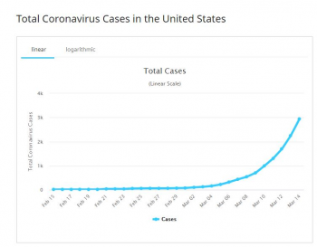
Now, the number of coronavirus cases is not doubling every day in the United States. Based on the current numbers, it's doubling every two to three days*. Thus, since the United States had 3,000 cases at the beginning of the week, we would expect to see 6,000 cases by midweek, 12,000 by the beginning of the next week, and so on. If (and this is a big "if") the exponential trend continues in this way, by the middle of next month we would have about 3,000,000 cases, which is close to 1 out of every 100 people in the United States.
Understanding exponential growth is key to understanding the spread of viruses. And it's clear that exponential functions are not well understood. Yesterday I saw a news headline that said something like "Italy had record number of new infections yesterday." If the journalist understood exponential functions, they would not use that headline, because that is not news. "Italy did NOT have a record number of new infections" would be newsworthy. In fact, since the point where Italy had a statistically significant number of cases, there have only been two days that they didn't "break their record."
Is the growth truly exponential?
Let's talk first about why we use exponential functions as a model for infection growth, and then we'll talk about the details of why this is not sustainable in any population. Suppose you have 5 people who are infected on Day 0. Let's further suppose that each of them infects one person every five days. Then on Day 5, there will be 5*2 = 10 people. Each of those ten people infect someone else, so on Day 10, there will be (5 * 2)*2 = 5 * 2^2 = 20 people. On Day 15, there will be (5 * 2 * 2)*2 = 5*2^3 = 40.
In general, on day 5n, the number of people will be calculated by p(5n) = 5 * 2^(n-1). If we do a substitution of m = 5n, we end up with the following:
p(m) = 5 * 2^(0.2m - 1)
Thus, at any day we can get a rough predictor of how big the infection will be. Want to know how many people infected there will be on Day 100? It looks like this:
p(100) = 5 * 2^19 = 2,621,440
Now, this function does not represent growth of the coronavirus. Currently the coronavirus is doubling every 3 days, so our scenario is worse than the given example.
Side note: in general, we write exponential functions in a slightly different way -- they look more like this: p(x) = ak^x, where k is (for a function that is growing) some number larger than one. This k value is very important, because a small difference in k can make a VAST difference in total infection. Consider these two functions:
p(x) = 1.2^x
h(x) = 1.3^x
If you calculate the infection after 100 days using p(x) you get p(x) = 82 million. However, if you calculate using h(x), you get 248 BILLION. Shrinking this k value is what people are talking about when they say "flatten the curve."
So back to the question: is the growth truly exponential? Yes and no. The growth starts out exponential in nature. However, there are a factors that can (and will) affect that. The biggest one is population size. If the population was infinite, then the growth would remain exponential. But in a finite population, the exponential growth cannot be sustained. After a while, there are many people who are infected, and so each infected person comes in contact with more infected people and fewer uninfected people. That means that as the growth of the virus builds in a population, the speed at which it grows slows down.
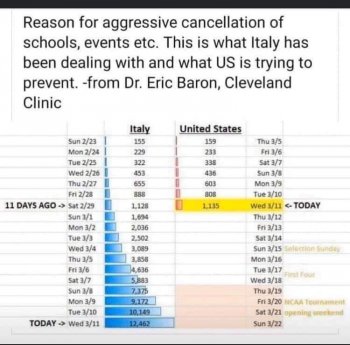
We're doing better than Italy, because we have fewer cases, right?
No. The fact that we have fewer cases is simply because the virus reached us later than it reached them. Our infection graph looks just like theirs, except it is shifted by a couple weeks. This is why so many charts are circulating that compare our statistics to Italy's with a date differential of a couple weeks.
We call this a "translation along the x-axis." It's a perfectly legitimate mathematical and scientific analysis technique, so when your friends tell you it's like "comparing apples and oranges," you can assure them it's not. Honestly, I think most people who use the "apples and oranges" argument know that's not true, but are a little too scared to admit it out loud. I could be wrong about that though -- I'm not a psychologist.
Anyway, back to the question at hand. The best measure of how we're doing is not the number of cases we have; it's the k factor in our exponential equation. Or, to describe it another way (using my original example) the best measure is our "doubling rate."
Based on the last numbers I checked, US infection has been doubling every two to three days, while Italy has been doubling every three to four days. So no, unfortunately, we are not doing better than Italy.
But we have a bigger population than Italy. Percentagewise, we're doing a lot better, right?
Sure. At the moment we have a smaller percentage than Italy. But that is only because we are running a couple weeks behind them. Remember what I mentioned above about the exponential growth being slowed because the population isn't infinite? Well guess what -- it is going to take much longer for the virus to reach that "critical mass" moment in the US because it has a larger population to work with. Let's suppose the infection graph for Italy levels off at 60% of the population. It's a reasonable expectation that the same will be true for us; the infection graph will level off at 60% of our population. It'll just take a lot longer to get there.
I understand the desire to factor a percentage into these calculations; it makes us look "better" and feel "safer" in the short term. But if you follow the equations through to their completion, that percentage will cancel itself out.
What does it mean to "flatten the curve"?
This was briefly addressed above. Flattening the curve means doing what we can to decrease the k value in our exponential function. Because k doesn't just depend on the virus -- it also depends on our actions. If we all spend all our time in large, crowded, public gatherings, then the k value will go through the roof, and it will take far less time for the virus to reach the entire population.
If we could do exactly the opposite, completely avoid one another, then each person who is infected would not be able to infect anyone else. In reality, in a society in which each person depends on many others, we cannot avoid contact. But if we can limit it, then we can significantly decrease the k value. This means that cases aren't coming in at such an alarming rate, and there's less risk of hospitals being overwhelmed (running out of supplies, personnel, time, etc.). That's what we mean when we talk about flattening the curve.
Why do some graphs show an exponential curve, and others show a bell curve?
The exponential curve (the one that doesn't go back down to zero) is a graph of people who have been infected with the virus. The bell curve (the one that goes up and then back down, making a lovely bell shape) represents people who are newly infected on a given day. Eventually, as mentioned above, the infection rate slows down, which leads to the dampening in new cases day by day.
In the chart that's been floating around [see above for an example chart] the numbers don't start at Day 1. Why?
That's a good question, which I've seen several people asking online. There are two reasons why the chart doesn't start on Day 1 (or patient zero, if you prefer). But before I get into this, I'd like to reiterate that it's not necessary to start at Day 1. The point of the chart is not to establish a baseline for one country, but rather, to provide a comparison between two countries when they are at a comparable stage of infection.
As I said, there are two reasons why these charts don't start at Day 1. The first is that no one knows when Day 1 is. Sure, Day 1 could be defined as the day the first patient was diagnosed, but mathematically that's not Day 1; Day 1 is the day the first infected person set foot on US soil. From a mathematical standpoint, that's really the day of most interest, and we don't actually know when that happened. For some countries, the day of first diagnosis might be very close to the actual "Day 1" but for other countries it is not.
The other reason is that what happens at the outset may not be statistically significant. Look at it this way: one of the first places coronavirus struck in the US was at a nursing home, and the mortality rate for our country was ridiculously high because of that. If that infection had happened three weeks later, when we have a much larger sample of cases to work from, that nursing home infection -- even if it resulted in the same number of infections and the same number of deaths -- would not have significantly skewed the mortaility rate because it would have been a much smaller fraction of the whole.
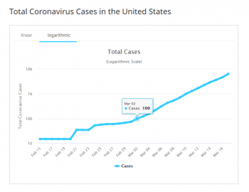
The graph below illustrates why we tend to ignore those initial values. This is a logarithmic graph, and if a graph is exponential, we expect its logarithmic graph to be a straight line. You can see that right around the time the US hit 100 cases, the graph settled down into a consistent straight-line graph. What happened before was unpredictable and not useful.
Another way of looking at it: if you wanted to calculate the probability of flipping heads on a fair coin, you wouldn't flip the coin 3 times, because you know that you wouldn't get accurate results that way; you'd flip the coin a hundred, or even a thousand times. The larger your sample, the more reliable the results.
At the very beginning, the numbers you have are really nothing more than "noise," and they don't provide any useful statistical information.
WHO (World Health Organization) put out an early estimate of 3.4% as the mortality rate. Is this number too high?
Probably. But I'm not an expert, and I'm not going to pretend I know better than WHO. Measuring a mortality rate is complicated by things like:
- You don't know about the cases that were asymptomatic (no symptoms).
- You don't know about the cases that produced symptoms, but the patient chose not to seek medical help.
- Until a known case is complete (either through death or recovery) it lands on the "non-mortality" side of the scale, which means it drags the rate down from what it should be.
- If you choose to base your mortality rate on completed cases, at first your numbers will be way off because the cases which close quickly are the ones that close with death. Survival cases take much longer to be cleared from the active list. This skews the measurement upward significantly, at first.
But there's something else to consider: these same caveats are also true of influenza. In other words, if the coronavirus mortality rate given is too high, it's reasonable to assume the influenza value is also too high. Consider this: CDC instructs people to contact their doctor if they think they might have coronavirus. But the CDC tells people that if they think they have the seasonal flu they should only contact their doctor under certain circumstances. In other words, the number of seasonal flu cases may be FAR more underreported than coronavirus cases.
Why does this matter? Because most of the time raw numbers don't mean a lot to us - they only mean something when they're given in comparison to another, better understood quantity. So the number 3.4% takes much of its meaning from the fact that we can compare it to the mortality rate for seasonal flu, which is around 0.1%. So if that's how you're using the coronavirus number, you should remember that the number you're comparing it to may also be too high.
In recent days I've seen reports that WHO has lowered their previous mortality estimate.
Why do different sources give different values for the number of infections?
Some sources are counting only confirmed cases, and some are also counting presumptive positives. A presumptive positive is a case which has been tested at a state or local lab, but has not yet been confirmed in a CDC lab. There is also another designation -- "POI" or "Person of Interest" I mention that merely for completeness; I don't think any sources are including POIs in their tallies.
Also, depending on the source you use, the numbers might not be updated on the same schedule. So someone might say, "I saw that we have 5,800 cases in the US," and you think to yourself, "I'm pretty sure I just read that there were 5,400 cases." Don't worry -- it doesn't mean you (or your friend) are consuming fake news. Of course, if your friend tells you there are only 500 cases, you might want to look into that with them!
The most important thing is not which data set you use, but that you use it consistently. If you look at one data set one day, and then the next day switch to a different one, that may very well be like comparing apples and oranges.
Does Population Density play a part in this?
Not being an epidemiologist, I won't try to give a definitive answer on this, but it does seem very likely that it does. Population density has to do with how many people there are per square mile. So, for example, New York City has a much higher population density than township T4-R9 in northern Maine (I wish there was a township R2-D2, but alas, that's not how the numbering system works). In a higher population density area, you have millions of people living in very close quarters, which makes it harder for them to distance themselves from each other. In rural areas, that distance is built into everything. One facebook meme I saw said, "Keep six feet away from each other? That seems pretty close to us Mainers!" I have friends who will say "Let's go to the city," and to them that means a full day trip, because the city they're talking about (Bangor) is more than 3 hours south of them. These folks are likely to have already fully stocked their freezers, pantries, etc, which decreases their need to get out of the house. They have social distancing built into the fabric of their lifestyles.
Conclusion
This blog post is long enough that when I was asked to discuss in more detail the significance of total population vs percent population data, I decided to start a whole new blog post. You may find that post interesting/valuable - especially if you have friends that are telling you percent population data is the only meaningful data.
[And please don't forget our many online educational resources: games, reference units, lesson plans, printable worksheets, and more.]
* A friendly reader pointed out that I didn't source this claim about our doubling rate. Since that number is in a state of flux, and by the time you read this, it may not be accurate any more, I'll do better than source it; I'll explain how you can estimate it for yourself without too much difficulty. Go to a reputable site which contains data about coronavirus infections. I've used multiple sites for redundancy, which is good because one of the sites I used (worldometers) got hit by a cyber attack a few days ago and had incorrect data up for a short period of time. Make a list of daily numbers. Now pick a number in the chart and double it. Count how many days you have to go down your list to find a value that is at least that value. Do this several times. You'll find that the doubling count mostly fall within a small range. That range is your approximate doubling range.


