Ask Professor Puzzler
Do you have a question you would like to ask Professor Puzzler? Click here to ask your question!

Every year that I teach Physics I run into a small problem with the labs my students do. Here's the problem. My students will collect data (and the issue happens most often when they're timing something) and then they'll look at their data and say, "Wow! One of those points is way off from the others!"
For example, their data points might be the following times in seconds: 4.2, 4.6, 4.3, 4.8, 7.2, 3.9
As they look at those data points, they'll recognize that most of them are in the vicinity of 3.9 to 4.8, but there's one value (7.2) that is way off from the others. Obviously something went drastically wrong with that trial!
So what do I tell them? I'd like to tell them, "Use your statistics knowledge to determine the outliers." Outliers are points like 7.2, which are clearly outside the reasonable range. That's what I'd like to tell them, but I don't, because I know perfectly well that many high school science students have not yet learned enough statistics to calculate outliers.
And I have no intention of spending my Physics class time teaching statistics!
So what do I do? I say to them, "If it looks ridiculous, dump it."
Now, that's a quick approach, and it saves a lot of time, but it's not really a "good" approach (although I'm not the only science teacher that does it!). Why is not a good approach? Because good scientists try to avoid using intuition and guesswork when selecting their data. That kind of fuzzy thinking can result in people massaging their data to make it say exactly what they want it to say.
So this year, I decided it was time to resolve that problem. Not by teaching my students how to find quartiles, interquartile ranges, and outliers. No...I decided to create a calculator that they could enter their data in, and have the calculator list their outliers.
And, while I was at it, since I realize these kinds of tools can be very helpful for both teachers and students, a whole section of statistics calculators was added to the site. These include calculators for various means (arithmetic, geometric, and harmonic), as well, as standard deviation, variance, and other useful statistical quantities.
You can find the calculators here: Professor Puzzler's Statistics Calculators.
Someone told me that "most people have a higher than average number of bones in their body." That doesn't even make sense to me. How can most people be above the average?
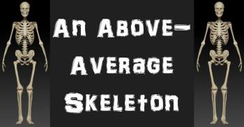
Whoever told you that is probably not right, but I'm pretty sure I know what they were reasoning. So first I'll explore their reasoning, and then I'll present an alternate view of the statement.
You see, the 'normal" human has 206 bones in their body, but the average number of bones in the human body, if you were to take a survey of all humans currently alive in the world - is slightly less than 206.
Why? Because some people were born without arms or legs. Others have had limbs amputated. So if you average the number of bones of all the people in the world, you'll end up with a number slightly lower than 206.
Let's just make up some numbers, so you can see what I mean.
We'll say that the population of planet earth is 8 billion people. Of these 8 billion people, we'll hypothesize that 0.5% of them have lost a limb (rough estimate based on the number of people in the U.S.A. with amputations), and that limb loss has cost them 30 bones (I'm completely making that number up).
So we have 7,960,000,000 people with 206 bones, and 40,000,000 people with 176 bones. How many bones is that in total?
7,960,000,000(206) + 40,000,000(176) = 1,646,800,000,000
That's a lot of bones! So to find the average number of bones per person, we divide by our 8 billion figure: 205.85.
Since most people have more than 205.85 bones, most people have a higher than average number of bones in their body.
Okay, so that's the reasoning your friend was using. But it's not quite right. Because, you see, when you are born you have about 300 bones in your body. These bones are connected by cartilage, and will eventually fuse together (the process by which cartilage turns to bone is called "ossification"). How long does it take this process to complete? Well, I don't know for sure. One site I looked at said the process is complete around the age of 20, another said 25. I didn't feel like tracking down more research on that, so let's go with the smaller number, and say the process is done at age 20.
This is important: I'm attempting to prove your friend wrong, which means that at every step, my rounding is going to be done in the direction that favors your friend's hypothesis. Because if he's wrong in the best-case scenario, then we know he's wrong for sure!
Now, I have no idea how many bones a child has at various ages, so here's what I'm going to do. I'm going to assume the best case scenario - every child under the age of 20 has 1 extra bone, leading to a huge chunk of the population having 207 bones instead of 206. Again, I know that I'm lowballing this massively, but my goal is to give your friend's hypothesis the benefit of the doubt.
So now we have to rework our numbers, and for this, I'm going to use 25% as the percentage of people in the world under the age of 20. This number is not completely out of my hat - I based it on some numbers for U.S.A. population, and rounded down a bit.
In our previous calculations, we had 1,646,800,000,000 bones, but now I want to break it down by adult vs. child, so I'm going to multiply that by 0.75 (75%) to get the number of adult bones:
Adult bones = 1,646,800,000,000(0.75) = 1,235,100,000,000
For children's bones, we'll take the total in our previous calculation and multiply it by 0.25 (25%). However, this number is based on 206 bones per person, so we're going to then divide by 206 and multiply by 207. This number isn't going to come out even, so we'll round down, in fairness to your friend's hypothesis.
Child bones = 1,646,800,000,000(0.25)(207)/206 = 413,700,000,000.
Now let's add the adult bones and child bones together: 1,648,800,000,000. This is only slightly larger than the other number we obtained (because I did so much rounding down), but it's enough to put us on the other side of 206:
1,648,800,000,000/8,000,000,000 = 206.1
So it turns out that most people (the adults without amputated limbs) have a below average number of bones. Bear in mind that some of these numbers I pulled out of a hat without a lot of research, but I think it's safe to say I lowballed enough numbers that we can be reasonably sure of the conclusion. If you disagree, drop me a note with your reasoning!
Dear Professor Puzzler,
Can you explain to me the difference between correlation and causation? Is there a difference?
Thanks,
Martin
Hi Martin,
Correlation is a strong link between two sets of data. For example, suppose I created a graph of electricity usage by month from January to December, and then, on top of that graph, I superimposed another graph of ice cream consumption per person by month, you might find a correlation between the two sets of data. As ice cream consumption increases, so does electricity usage. Similiarly, as ice cream consumption decreases, electricity usage does also. We say there is a correlation or link, between those two data sets. We haven't made any claims about the reason for that link; we have simply acknowledged that the link exists.
Causation is a word that is used to indicate that one thing causes another. Causation is NOT the same as correlation. Consider the example of the ice cream and the energy usage. Does eating ice cream cause you to use more electricity? Of course not! Does using electricty cause you to eat ice cream? No! Those are both silly ideas!
So what's going on here? It's simple: as temperatures increase, people are more eager to eat ice cream, because it cools them down. But at the same time, people are running air conditioners more, and their refrigerators are working harder because of the heat. Both the ice cream consumption and the energy consumption are a result of the changing temperatures from one month to the next.
This is why it's very important to understand that correlation does not imply causation. Just because two things have a correlation does not mean that one causes the other!
Here's another example. Take a look at the chart below. It's used as proof that autism is caused by the use of herbicides on crops:
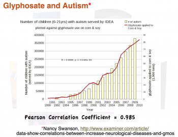
It shows a very definite correlation between herbicide use and autism. Later on we'll tear this graph apart, because it is one of the most attrociously unscientific graphs I've ever seen, and the fact that it's linked from the home page of an MIT researcher is downright embarrassing. But we'll get to that a bit later.
Now that you've looked at this graph and drawn the obvious conclusion: Herbicide causes autism, take a look at the next graph, which shows another, quite surprising correlation.
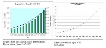
Yes, that's right - you're reading that graph correctly. There is a very clear correlation between purchase of organic foods and autism. The conclusion is very clear: Organic foods cause autism!
I'm sorry, you can't have it both ways. If the first graph (which is merely a correlation) is proof of causation, than so is the second one.
The real challenge is this: if you can't eat chemically treated crops, and you can't eat organic crops, how do you avoid autism without starving to death?
The Embarassing Glyphosate and Autism Graph
I promised we'd tear apart that herbicide/autism graph, and we will. This graph has been shared on the home page of an MIT researcher (whose post graduate degrees are in Electrical Engineering and Computer Science). Never mind the fact that she probably doesn't have any business meddling in biology related stuff, if you have a masters degree or a Ph.D. in any subject area, you know enough to realize that this chart is horrifically nonsensical. For crying out loud, my high school science students probably know enough to realize how dumb this chart is.
So, is this graph really so bad? And if so, how? Oh, let me count the ways...
- The graph uses total numbers of autism cases instead of autism cases per capita, which means it does not take into account population increase (which was significant between 1990 and 2010).
- The graph shows only autistic children served by IDEA (Individuals with Disabilities Education Act). What's wrong with that? Oh, I don't know, maybe the fact that IDEA started serving autistic children in 1990, which means the first few years of that graph are ramped up because IDEA was ramping up.
- The graph does not take into account the fact that diagnosis rates have significantly increased over that time interval; more and more children who used to be diagnosed with mental retardation are now being diagnosed as autism spectrum.
- The graph shows total gallons of herbicide, without any reference to gallons per acre, or number of acres of cultivated land.
- One chart represents USA numbers (autistic children served by IDEA) while the other chart is worldwide (do you really think we don't export significant amounts of corn and soy? Check the USDA site if you doubt it!) If you're comparing US numbers with global numbers, you're not just comparing apples with oranges, you're comparing apples with harmonicas. Or some equally absurd comparison.
- The correlation goes even further out the window if you attempt to limit your gallons of herbicide to ONLY crops used for human consumption. Based on a quick scan of USDA and NCGA websites, it appears that the amount of corn used for ethanol is from 20% to 40% of the entire corn harvest, and that number is rapidly increasing.
Are there more problems with this graph? Oh, undoubtedly! Those are just the ones I came up with off the top of my head, without doing any serious research. And yet, ironically, the "researcher" who shares this on her home page has the audacity to whine about scientific journals that have unfair standards of statistical analysis.
So, Martin, you probably got more than you bargained for - this turned into a little rant (hope you don't mind). But I hope it'll help you remember that just because two things have a correlation doesn't mean that one caused the other!
Professor Puzzler
P.S. If you're wondering why I didn't rip the second chart to shreds, it's because no one actually believes the second one; it was created entirely to prove a point. The organic-food chart (along with a diabetes chart) can be found here.

