Ask Professor Puzzler
Do you have a question you would like to ask Professor Puzzler? Click here to ask your question!

Have you ever wondered why news sites will occasionally put the word "Report" in their headlines? For example:
Report: Abraham Lincoln Thinks the Internet Is Dumb
or
Alien Spaceship Lands in New York City: Report
These headlines are, of course, a bit silly. But why is the word "Report" in there? Here's an example of why this might happen:
The New York Times does some investigative journalism and discovers that Cinderella is actually as mean and nasty as her wicked step-sisters, and spends her weekends beating up kids at playgrounds and feeding cyanide to pigeons (with all due respect to Tom Lehrer). So they write up a major news article about Cinderella and her weekend habits.
Now someone at CBS catches this story and thinks, "Our readers should know the truth about Cinderella, too!" Unfortunately, no CBS reporter has actually independently verified the details of the story. Under these circumstances, CBS might publish a headline like this:
Report: Cinderella Kills Pigeons
Then somewhere in the article (usually in the first paragraph, but not always), there will be a phrase like this: "according to a new report by NYT..." If it's an online article, that phrase will likely be a link to the original New York Times article.
The addition of the word "report" into the headline does two things for the news site. First, it allows them to acknowledge that they're using someone else's information. But also, it allows them to maintain some deniability. "We're not saying this ourselves, we're just telling you what someone else said," is the implication.
It can be dangerous, because it does allow dishonest sites to get away with all sorts of false reporting. If I can find someone (anyone) who claims that the wicked witch was not planning to eat the children, I can create a headline like this:
Report: Gretel Burns Innocent Woman Alive
In other words, if you are unscrupulous, you can get away with passing off a rumor as a news story.
Fake news sites and Fringe news sites have been using this technique for years, because they understand some very important psychology:
- If you want someone to believe something, put it in the headline, because most who see the headline as they're scrolling through their social media will not click through to read the story. There have been studies done on this: Americans are relying more and more on headlines to get their news. According to an API study done in 2014, less than half of Americans surveyed read past the headlines in the last week. If you think that statistic has gotten better in the last six years, then: "Report: I've got a bridge to sell you."
- Even if they do click through, the headline itself has framed the reader's understanding in such a way that they are prone to accept the reporting as factual, even if it turns out that the source is utterly unreliable. (Check out the following New Yorker article, which examines an APA study on this topic).
For fake news sites, this is a win-win situation. Whether the person reading the headline clicks through to the article or not, their perceptions of reality have been changed. And if they do click through, the fake news site earns money from advertising. I've been watching fringe news sites do this for several years, and they are getting very good at it. Pay close attention to every article you read, and evaluate the reliability of their sources. Resist the temptation to read a headline and scroll on without investigating. If you read a headline, and don't have time to read the article, assume it's not true (particularly if you're not familiar with the source). Once you find a site that regularly uses techniques to pass off rumor as truth, avoid clicking through to their articles - do your part to help dry up their revenue sources.
Here's a fun question regarding an upcoming snowstorm:
"4 to 8 plus 4 to 8 equals 8 to 16, right?"
This is in reference to a prediction that tomorrow there will be 4 - 8 inches of snow, and then tomorrow night there will be 4 - 8 inches of snow. The questioner is suggesting that this means there will be a total of 8 - 16 inches of snow.
It seems reasonable, right? Except we're all pretty sure we're not going to see anywhere near 16 inches of snow in the next 48 hours. So why can't we just add these two ranges together?
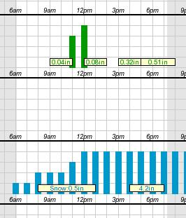
Meterologists have a LOT of unknowns they have to deal with (and I'm not a meteorologist, so I'm not going to pretend I know even a tenth of the variables they deal with). But what I do know is that one of the broad uncertainties is when a storm will pass through. If you look at the chart here (taken from an actual hourly forecast on the National Weather Service website), you'll see that they don't actually know when the storm will start; the snowfall bars begin (with low probability) at 6:00 AM. It's not until noon that they're saying with confidence, "We'll have snowfall by now."
So hypothetically, if the snowstorm starts at 6:00 AM, and goes all day, maybe we'll get 8 inches of snow during the day. But if that happens, the storm will be mostly over by evening, and maybe we'll get 4 inches overnight.
On the other hand, if the storm doesn't start until noon, maybe we'll get 4 inches during the day. But then the storm will last longer into the night, and maybe we'll get 8 inches overnight.
What I've just described is a scenario in which we get a maximum total of 12 inches. But if we were to break it down by how much falls during the day and how much falls at night, we'd have to say "4 - 8 during the day" and "4 - 8 during the night" - even though we feel confident that the storm won't give us more than 12 inches total.
What we're seeing is that a portion of the snowfall could come during the day, and it could come at night. Since we don't know when, it gets listed in both time periods.
Watch the forecasts and see how they line up from storm to storm, and you'll see what I mean: if the daytime forecast is accurate, the overnight forecast will likely be overkill. And vice-versa. Of course, we don't always notice this, because as the storm gets closer, the meteorologists are able to refine their models better.
Then we just whine that the meteorologists have been "hyping up the storms." :D
As I mentioned before, there are undoubtedly many many more variables that I'm not considering, but my purpose here was to show wny you can't just sum the ranges to get a total.
Maizi from Norwich asks, "Four positive whole numbers add up to 84 One of the numbers is a multiple of 17 The other 3 numbers are equal. What are they?"
Hi Maizi, as is my custom with math problems, I'm not going to answer your question; instead I'm going to invent a similar problem and show you the technique for solving it. This will allow you the satisfaction of solving this particular problem on your own. So here is my problem:
Five positive whole numbers add up to 97, and one of them is a multiple of 19. The other four numbers are all equal. What are they?
First, we consider that if we add together four equal numbers, the result must be a multiple of four. For example, 7 + 7 + 7 + 7 = 28, or 11 + 11 + 11 + 11 = 44.
Algebraically, we'd say that n + n + n + n = 4n.
So this means that if we subtract the first number (the one that's a multiple of 19) from 97, we will have a result that is a multiple of 4.
What could the first number be? 19, 38, 57, 76, or 95. Any other value is larger than the sum of 7, which is not possible if all the integers are non-negative.
Based on this, we can find all possible sums of the other four numbers, by subtracting each of the numbers above from 97:
97 - 19 = 78
97 - 38 = 59
97 - 57 = 40
97 - 76 = 21
97 - 95 = 2
Remember what I said earlier? The other four numbers must add to a multiple of 4. The only one of those sums above that is a multiple of 4 is 40. Therefore, we conclude that the first number is 57, and the other four numbers are each 10 (because 40 / 4 = 10).
I hope that's helpful; good luck with your version of the problem!
Rosanna from Italy writes, "I'm an Italian student of English, dealing with learning literature. Introducing the Medieval ballad, after analysing Lord Randal, we're analysing Geordie, the English version. Our book text introduces the counting of stressed and unstressed syllables in medieval ballads but the answer seem to get me confused because it is said that there is a mixed of four and three stressed syllables lines without indicating the lines. Can you tell me what the lines are, what the stressed and unstressed syllables are and if we can specify if they are iambic or anapest feet? Thanks in advance, I really need your help!"
As I walk’d o’er London Bridge
One misty morning early
I overheard a fair pretty maid,
Was lamenting for her Geordie.
"O, my Geordie will be hang’d in a golden chain,
’tis not the chain of many,
He was born from King’s royal breed
And lost to a virtuous lady."
Go bridle me my milk-white steed,
Go bridle me my pony,
I will ride to London’s Court
To plead for the life of Geordie.
"O Geordie never stole nor cow, nor calf,
He never hurted any,
Stole sixteen of the King’s royal deer
And he sold them in Bohenny.
"Two pretty babes have I born,
The third lies in my body,
I’d freely part to them ev’ry one
If you’d spare the life of Geordie."
The judge look’d over his left shoulder,
He said, "Fair maid, I’m sorry,
So, fair maid, you must be gone,
For I cannot pardon Geordie."
O my Geordie will be hang’d in a golden chain,
’tis not the chain of many,
Stole sixteen of the King’s royal deer
And he sold them in Bohenny.
Hi Rosanna, you've got an especially interesting poem to decipher. Ballads are made challenging by the fact that they were originally intended to be sung rather than spoken. Song-writers often feel like they have more flexibility in their writing than poets who intend their poems to be spoken. The reason for this is that it's easier to cram extra syllables into a song; all you have to do is take a quarter note and change it into two eighth notes, and you've put an extra unaccented syllable between your accented syllables.
To see this illustrated, a good starting point is to find an audio recording of the ballad and listen to it. Here's one I found. The lyrics are not exactly the same as the copy you sent me, but they're fairly close. Geordie Ballad on YouTube.
One of the best lines to hear this "syllable cramming" that I mentioned above is the first line of the repeated chorus in the video:
"He never stole a cow, never stole a calf"
When you listen to that line, you can hear that the singer is really working to fit extra syllables in. In particular, "stole a" in the first half of the line and "never" in the second half are jammed together to make the line of music flow. If you focus your attention on what syllables get accented here, what you'll hear is:
'he NEV-er stole a COW, nev-er STOLE a CALF"
Interesting, isn't it, that the first time the word "never" shows up it has an accented syllable, but the second time it shows up, the entire word gets jammed into the space between two accented syllables. This sort of thing makes poetry both interesting and challenging!
If I were going to break this down by accented and unaccented syllables, I might replace each unaccented syllable by a lower case "x" and each accented by an exclamation mark. It would look like this:
x ! x x x ! x x ! x !.
This doesn't seem terribly helpful; the number of unaccented syllables does not stay consistent throughout the line. However, at the very least we can tell that there are four accented syllables in this line. Now let's look at the next line:
"He never murdered any."
This one is much more straightforward, and if you just simply read it aloud, you would hopefully hear the natural rhythm of it:
"he NEV-er MUR-dered AN-y"
So this one is: x ! x ! x ! x, which has three accented syllables.
The next line is "STOLE six-TEEN of the KING'S ro-yal DEER" , which is: ! x ! x x ! x x !.
And finally: "and he SOLD them IN bo-HENN-ey" or: x x ! x ! x ! x.
Let's put it all together to make an accent "map" of the chorus:
x ! x x x ! x x ! x !
x ! x ! x ! x
! x ! x x ! x x !
x x ! x ! x ! x
If you count up the exclamation marks in each line, you'll find that the pattern for the number of accents in each line is 4 - 3 - 4 - 3, which answers the first part of your question.
Now to answer whether it's anapestic or iambic (or something else altogether), I looked at the second line and noticed that it is almost perfectly iambic (unstressed, stressed), except for the extraneous unaccented syllable. On the other hand, the very next line is missing an unaccented syllable at the beginning, which makes up for it. So my money is on this being iambic heptameter (because a line of four and a line of three add up to a total of seven iambs). To convince myself that I'm right about this, I go back and listen again, and everywhere I hear the singer doing "syllable cramming", I replace the crammed syllables with a single unaccented mark:
x ! x ! x ! x !
x ! x ! x ! x
! x ! x ! x !
x ! x ! x ! x
Aside from the fact that we have two lines that end with an extra unaccented syllable, this is iambic.
So now that you know this is a very "loose" iambic heptameter, you can go back to your version of the ballad, feeling confident of what the meter is. Your only challenges, then, are determining which syllables get stressed, and figuring out where the "syllable cramming" happens. Good luck!
Incidentally, as a side note, I think that the addition of those unaccented syllables at the end of each pair of lines gives it a sense of being unfinished, which adds to the melancholy feel of the piece.
After a few back-and-forth messages with Rosanna, here are a few more helpful tips for people trying to parse accented/unaccented syllables in a poem:
- Once you think you've figured it out, read it out loud, strongly emphasising (speaking loudly) the syllables you marked as stressed. This may help you identify mistakes you've made.
- If you know how many stressed syllables there are supposed to be in each line, that's very helpful information, because while a poet may mess with the unstressed syllables, they're less likely to change up the number of stressed syllables.
- You're unlikely to find two stressed syllables in a row.
Michelle from Maine wants an explanation of the difference between linear-scale graphs and logarithmic-scale graphs. Her question relates to coronavirus infections and COVID-19 deaths, so I'm going to use COVID-19 data in my answer.
For this explanation, I'll going to use the data for US coronavirus infections, from March 10, 2020 to March 31, 2020. That data is shown below. The data was obtained from Worldometer stats from April 1, 2020.
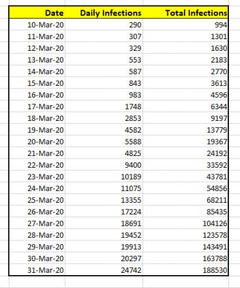
If I wanted to simply chart the total number of cases against the date, the graph would look like this:
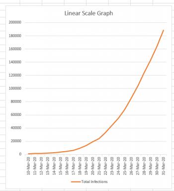
Now, this graph looks a bit scary, because it's clear from this graph that the number of cases is skyrocketing very quickly. And this is the nature of an exponential curve. If we could continue this graph a month into the future, and the growth remained as it currently is, it would still have roughly the same appearance, except that instead of the March 31st data being at the top of the graph, it would be down near the bottom because the new numbers would completely dwarf it.
It's important to know that in recent days this is not the graph which has been making the rounds on social media and in news articles. Mathematicians (and scientists) have a different type of graph we like to use when we're dealing with exponential curves: it's called a logarithmic scale graph. In a logarithmic graph, we keep the x-axis (the date values) the same, but we do some "squishing" of the y-axis. How do we perform this squishing?
Logarithmic Squishing
Normally if you were drawing a graph on a piece of graph paper, you would say, "Each square is worth 1 unit," or "Each square is worth 100 units." But regardless of what you decided, you would consistently consider each square to be worth the same amount. You can see that this is what we've done in the linear-scale graph above. Each horizontal line marks off the same amount: if you go up one line, you've gone up 20,000 infections. That's true at the bottom of the graph, and it's also true at the top of the graph. (200,000 - 180,000 = 20,000).
But if you're drawing a logarithmic graph, each square height has a different value depending on how far up the graph it is. If the first square is worth 1 unit, the square above it is worth 10 units, the square above that is worth 100 units, and the square above that is worth 1000 units. You can see what's happening, right? Every square is worth TEN TIMES as much as the square below it. The result is that the entire graph gets squished. For mathematicians and scientists it's a great way to get a lot of data into a single graph. This is what our data looks like when it's graphed this way:
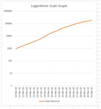
Notice how the difference between the first two horizontal lines is 10 - 1 = 9 infections. The difference between the next two horizontal lines is 100 - 10 = 90. Continuing on to the top, we see that the difference between the last two lines is 1,000,000 - 100,000 = 900,000.
It's really, REALLY important to understand that the two graphs above are actually BOTH SHOWING THE SAME DATA, just in very different ways.
Logarithmic scale graphs can be very useful; if a graph is exponential, its logarithmic counterpart will be a straight line. The slope of that straight line (how steep it is) helps us understand how quickly the graph is rising. It basically becomes a rate-of-change graph, which is why most news sites that are showing multiple states/countries in the same graph are using a logarithmic scale. Comparing the logarithmic graphs lets us see more easily which states/countries are doing better/worse at containing the infection. If the logarithmic graph for New Jersey is steeper than the logarithmic graph for New York (which it currently is) that helps us to understand that the infection is spreading more rapidly in New Jersey (even though the number of infections in New York currently VASTLY outnumbers the New Jersey infections).
The Danger
The danger, of course, is that most people don't really understand the difference between a linear-scale and a logarithmic-scale graph. So when we repeatedly see logarithmic graphs, it's easy to get fooled into thinking that the growth is linear, when it's actually exponential. If you are looking at a news site that shares graphs of infections (or deaths) look for an option to go in and out of logarithmic mode. Look at the data in BOTH modes, now that you understand why the modes exist. The linear-scale graph gives you reality, while the logarithmic-scale gives you a mathematical tool for comparing rates of growth.


